The Comic Sans Secret Menu
by quine spiders (2022-04-07)
[record scratch] yep, that’s our web browser. you’re probably wondering how we got here.

if you can’t tell already, we unapologetically LOVE comic sans. we think the lighthearted aesthetic of it is cute, and appreciate the way that every letter feels like it fits in with the vibe. you can show somepony even the most typographically boring letter, “o”, out of context, and they might be able to identify it as comic sans! it mitigates the the I/l problem pretty well (something a lot of supposedly “better” fonts fail at), it’s got single story g’s and a’s, and it has a comfortable visual weight.
a lot of dyslexics find comic sans easier to read, and while we’re probably not dyslexic, we also consider that to be true for us! a piece of accessibility software we rely on, dark reader, also has the ability to replace all fonts on websites with your preferred font, and we’ve had it set to comic sans for so long now, that it hardly even registers anymore. “normal” fonts standout alot more to us.
but something we’ve found is that overriding the font in your browser can lead to some unexpected results. we first discovered comic sans' secret menu on accident. we were browsing the scp wiki, when we were confronted with the above picture.
“what the heck??” we said. we weren’t really sure what we were looking at. we brought our laptop to our girlfriend. “what the fuck??” xie said. after playing around with the web inspector, xie understood what was happening.
the website had some font features enabled in its css for its original font. dark reader does not disable font features when it replaces fonts (probably a bug), and comic sans enabled the the font features requested, except the names of some font features are generic and what exactly they activate changes between fonts, so we ended up with this really janked up version of comic sans. ohhh.
sorry, what’s a font feature?
many modern (opentype) fonts have “font features”. these settings are implemented by the font creator and allow a typesetter to tweak how certain characters are rendered visually while still keeping the underlying text the same.
to a casual computer user, font features are not widely known; while some word processors (like libreoffice) have implemented them, mainstream word processors (like google docs) do not.
they are more commonly known to people who use publishing software or write websites, and care alot about how the text looks. if you know somepony who can distinguish arial from helvetica with a single glance and who pays for a web font license, they probably know about font features. even worse, they probably have Opinions about font features!
as referenced earlier, you can turn font features on and off with css. the mdn page for font-feature-settings has some useful examples of how to do this. apparently using this declaration is discouraged, but that’s outside of the scope of this article (we aren’t web developers, we just make a website). we are here for one thing: comic sans!
comic sans: a guided tour
swashes (swsh, ss01)
activating the swsh feature turns capital letters into
swashes (extra fancy letters). these are very fun for titles and they
look extremely cool, but they easily become unreadable in
acronyms/all-caps text, and they can make body text a bit jarring. for
reasons we don’t understand, ss01 also turns on
swashes.

small caps (smcp, c2sc)
there are two ways to get small caps: smcp converts lower
case letters to small caps while leaving uppercase letters at their
usual size.
c2sc converts only uppercase letters to small caps while
leaving lower case letters alone. with mixed case text, this can produce
some strange looking output:
these two features cannot be combined; from our testing it seems that whichever is set first will take precedence.
bonus round: swashes AND small caps (ss02)
ss02 converts all uppercase letters into swashes and all
lower case letters into small caps. the results look like something out
of a children’s book so antique that the child who originally
owned it has passed away from old age. so refined!
discretionary ligatures (dlig)
dlig enables a couple of decorative
(“discretionary” in typesetter speak) ligatures, which
visually combine fi and fl into a single glyph:

double story g’s and a’s (salt, ss03)
“mom can we get comic sans?”
“we have comic sans at home!”
comic sans at home:
of all the font features we’ve talked about, this one is strangely the most disturbing to us. it’s subtle enough that you might not consciously notice it at first, so you wind up with this sense that you’re looking at comic sans, but something is wrong, and you don’t know what. it’s a comic sans impostor!
double story as and gs are enabled using the the salt font
feature, (or ss03, which, for reasons we don’t
understand, seems to do the same thing). salt stands for
“stylistic alternates”.
the g’s in normal comic sans look accurate to real pawwriting. we
like this. we don’t know anypony who writes their g’s
backwards with that wild extra loop. we don’t even know how to
write them ourselves! we similarly love how chill the single story
a’s look, but because their tails are so short, they’re
easily confusable with o. this is comic sans' biggest shortcoming as a
font. enabling
salt makes the a’s more readable, but at the expense
of making the g’s less cute.
fancy numbers (onum, tnum)
the onum font feature enables these fancy-looking
“old style” digits with varying heights (the o stands for
old)! here is a comparison:

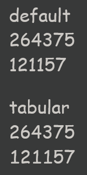
digits in comic sans are proportional by default, which means numbers
like 1 have a smaller width, and they won’t line up if you make a
table with them. but if you enable the tnum (tabular)
feature, they will become monospace and make nice little rows:
wakamaifondue says that comic
sans also has support for the pnum (proportional, i.e.
non-monospace) and lnum (lining, i.e. all digits have equal
heights) font features, but because comic sans is both of those things
by default, they don’t actually do anything.
non-latin characters
these are not font features, strictly speaking, but comic sans has some non-latin character support. the cyrillic alphabet is even here!

it’s also got the greek alphabet, which you could use to, you know, display greek…

... or you could even typeset some mathematical equations in comic sans using some of its extra characters!

donald knuth please implement a comic sans clone in LaTeX we know you’re ignoring our emails
wait a second i have comic sans installed on my computer and it doesn’t do any of these things!
these features, alongside true italics and boldface, were introduced in 2011 as part of comic sans pro, which seems to have been a Haha Only Serious april fool’s joke. they were later incorporated into the windows 8 version of comic sans, and remain a part of windows 10. we assume they’re also available on windows 11 but we haven’t used it. if you are on macos or linux, unless you went out of your way to aquire the modern version of comic sans, you are probably using the older version without these features.
conclusion
the thing we find fascinating about all of this is that when comic sans pro was announced over a decade ago, there were lots of news articles poking fun at it. yet in the modern day, when people talk about comic sans, they don’t mention any of this stuff. the fact that the rabbit hole goes this deep is mostly just absent from the popular consciousness.
then again, it takes a special kind of person to simultaneously be typographically inclined enough to know about font features, yet also like and care about comic sans enough to learn this kind of stuff. the popular discourse among typography people is a surface level “comic sans bad” and that’s where any thought on the matter usually stops.
everypony is entitled to their own tastes but we think the bandwagon effect that discourse has makes people thoughtlessly reject things they don’t actually know that much about. perhaps there’s a takeaway for life in general here.
we still have questions about this mysterious creature known as comic sans. how does it have these opentype features when the font file on our computer is a truetype format? what’s with the redundant font feature settings?
but we have learned one thing from this adventure: like stealing the coveted office printer on your last day of work, when we switch to linux once more in the near future, we are bringing our comic sans font files with us.